Find us at booth #83, join us for a harbor side happy hour, or catch Gorish’s talk.

Sept, 16-18 > Learn more

%20(1).avif)
Mamta Tainwala

September 2, 2026
%20(85).png)
TL;DR: The best sales dashboard is not the one with the most charts. It is the one with the fewest numbers that still changes what you do on Monday. This guide gives you the shortcut version: the essential KPIs grouped by the question they answer, dashboard examples for reps, managers, and executives, five templates to steal, and the mistakes that quietly kill most dashboards. One argument runs through all of it: dashboards fail on data before they fail on design, because a dashboard built only on CRM fields can show you what reps logged, never what buyers said.
A sales dashboard is a visual, real-time view of the metrics that drive your decisions: pipeline, conversion, quota, forecast. If you want the full definitional guide and the step-by-step build process, we wrote that separately: what a sales dashboard is and how to build one. This page is the shortcut. The types, the templates, the KPIs worth stealing, and the mistakes worth skipping.
Let us be adults for a second: you did not come here for a definition. You came here because your current dashboard has forty-three widgets and answers zero questions. Let's fix that.
The golden rule: if a metric does not inform a specific decision, it is noise. Cut it. Here is what survives the cut, grouped by the question each set answers.

For the deeper cut on which of these still matter as AI reshapes selling, see our guide to sales KPIs in the age of AI.
One dashboard for everyone is one dashboard for no one. Here is what each role's version looks like and why.

Job: daily self-management. Personal quota attainment, pipeline value and deals by stage, next steps due today, recent activity, and upcoming meetings with prep status. Everything else is a distraction from the deals in front of them.
The best rep dashboards also pull in conversation intelligence, so deal summaries, buyer sentiment, and AI-detected next steps sit next to the pipeline instead of in a separate tab nobody opens.

Job: deciding where coaching time goes this week. Team attainment by rep, pipeline health across the team, win rate by rep and stage, at-risk deals needing intervention, and performance trends. A good manager dashboard surfaces the pattern without requiring forty-seven one-on-ones to extract it.
For turning that visibility into structured reviews, our sales pipeline management guide covers the operating rhythm.
Job: resource allocation and board-level answers. Revenue closed versus target, forecast for this quarter and next, pipeline coverage trends, win rate and deal size trends, revenue by segment, and CAC against profitability. Executives do not need every deal. They need to know whether the number is safe and where the risk hides.
Job: volume management for SDR and inside sales teams. Calls, emails, meetings booked, response rates by channel, and time spent selling versus admin. Useful, with one warning label: activity only matters when it generates pipeline. Optimize this dashboard in isolation and you will get exactly what you measured, which is motion.

Job: funnel health. Pipeline value by stage, deal aging and stalled opportunities, new pipeline added, deals moving forward versus backward, and conversion rates between stages. If the funnel and pipeline distinction is fuzzy on your team, our pipeline vs. funnel guide settles it.
Want to skip the blank-canvas stage? Adapt one of these.
1. Basic sales performance template. For small teams and solo reps. Quota progress bar, pipeline by stage as a visual funnel, top five deals by value, this week's activities, month-to-date closed revenue. Build it in Google Sheets, Excel, or your CRM's native dashboards.
2. Pipeline dashboard template. For teams hunting bottlenecks. Pipeline value trending over time, deals by stage in count and value, average time per stage, stage conversion rates, created versus closed this period. Build it in any CRM or BI tool.
3. Manager team template. For frontline managers running 5 to 15 reps. Attainment leaderboard, coverage by rep, win rate by rep, activity benchmarks, at-risk deals flagged for review. CRM dashboards handle this well.
4. Executive revenue template. For VPs and the C-suite. Revenue versus target, forecast with confidence levels, six-quarter revenue trend, coverage ratio, win rate and deal size trends, CAC and CLV. Best built in a BI tool connected to CRM and finance data.
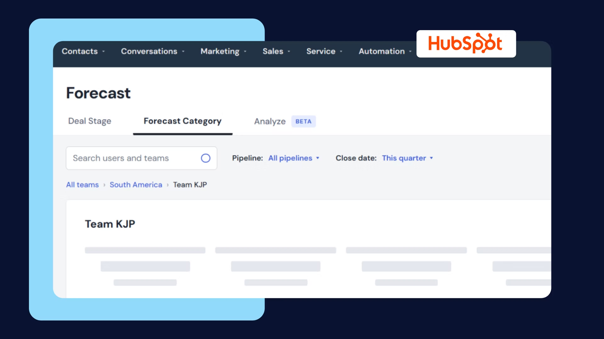
5. Forecast dashboard template. For teams that keep missing their own predictions. Commit, likely, and best-case scenarios, forecast versus actual history, weighted pipeline by stage, top opportunities by close probability, slippage trends. Pair it with our pipeline reporting guide for the reporting layer underneath.
Every template above is a starting point, not a finished instrument. The build process itself (defining the decision, choosing the audience, auditing your data sources, picking a build path) deserves its own guide, and we wrote one: how to build a sales performance dashboard step by step.
The short version: pick the template that matches your role, cut it to the six to nine metrics tied to real decisions, and automate the data feeding it. A template running on stale manual data is a screenshot with extra steps.
Here is the argument that separates good dashboards from great ones, and it has nothing to do with chart types.
Your CRM dashboard only shows what gets logged. CRM fields record seller activity: stage changes, logged calls, notes typed from memory. They do not record buyer reality: whether the prospect actually engaged, mentioned budget, expressed urgency, or name-dropped a competitor in minute thirty-eight.
So traditional dashboards are built almost entirely on lagging indicators, while the leading indicators sit unwatched in your sales conversations.

This is where conversation intelligence changes the equation. Layered on top of your CRM data, it tracks buyer engagement and sentiment during calls, talk-time and question patterns, competitor mentions and objections, and buying signals and risk flags. It is the difference between knowing a demo happened and knowing the prospect checked out for twenty minutes while the rep toured features nobody asked about.
With Sybill, that intelligence flows into the dashboard layer automatically: deal summaries synthesized from every call and email, risk indicators grounded in sentiment and engagement, next steps extracted from conversations and logged without anyone typing. See Sybill's sales workspace for what pipeline visibility looks like when it includes what buyers actually said.
Every dead dashboard in your company died from one of these.
1. Activities over outcomes. The dashboard celebrates calls made and emails sent while pipeline stalls. The fix: activity metrics support outcome metrics, never replace them. A hundred calls and zero meetings is a coaching conversation, not a win.
2. Information overload. Forty-seven charts, zero decisions. The fix is the golden rule from the top of this page: every metric must inform an action, or it goes.
3. Stale data. Monthly PDFs emailed around are not dashboards; by the time anyone reads them, the deals already slipped. The fix: real-time or near-real-time feeds, no manual refresh dependency.
4. No owner, no action. The dashboard shows win rate dropping and everyone nods. The fix: every metric gets an owner and a trigger. Coverage below 3x means prospecting doubles this week. Win rate falls, lost-deal review happens Friday.
5. Garbage data underneath. The most common killer and the least discussed. Beautiful charts on CRM fields nobody updates produce confident, wrong answers. The fix is structural, not motivational: automate the capture. Sybill fills CRM fields from calls and emails automatically, which is how the data stays true without asking reps nicely. For the ops-level playbook, see our sales ops solutions guide.
Notice that only two of the five are design problems. Dashboards fail on data and ownership long before they fail on aesthetics.
The next generation of dashboards will not just display what happened. They will answer questions, flag what is about to happen, and say what to do about it. Predictive deal scoring, risk detection from engagement patterns, plain-English insights instead of charts you interpret yourself.
At Sybill, this stopped being a roadmap slide. You can now describe a dashboard in plain English and get it built in seconds, powered by your calls, emails, and CRM data together. Ask for "the objections in every deal we lost last quarter, broken down by competitor" and you get an interactive dashboard you can refresh, export, and share with people who never log into Sybill.
The dashboards in this guide show you what happened. That one tells you why. Try it free on your own pipeline.
What should be on a sales dashboard?
The metrics that directly inform decisions: quota attainment, pipeline value by stage, win rate, and sales cycle length at minimum. Reps add personal pipeline health and next steps; managers add team comparisons, stage conversion rates, and at-risk deals; executives add revenue trends, forecast accuracy, and coverage. Include only metrics that trigger a specific action and cut the vanity numbers that look impressive without changing behavior.
Which sales dashboard template should I start with?
Match the template to your role and one decision. Reps should start with the basic performance template (quota progress, pipeline by stage, top deals). Managers should start with the team template (attainment leaderboard, at-risk deals, win rate by rep). Executives should start with the revenue template (forecast, coverage, trends). Customize after two weeks of real use, not before.
Where can I find free sales performance dashboard templates?
Salesforce, HubSpot, and Pipedrive all ship free customizable dashboard template libraries, HubSpot offers a free sales metrics Excel template, and Google Sheets has community templates you can copy. BI tools like Tableau and Looker include sample sales dashboards. Start with a template matching your role, then tailor it to your process; templates are starting points, not finished dashboards.
The metrics that directly inform decisions: quota attainment, pipeline value by stage, win rate, and sales cycle length at minimum. Reps add personal pipeline health and next steps; managers add team comparisons, stage conversion rates, and at-risk deals; executives add revenue trends, forecast accuracy, and coverage. Include only metrics that trigger a specific action and cut the vanity numbers that look impressive without changing behavior.
Match the template to your role and one decision. Reps should start with the basic performance template (quota progress, pipeline by stage, top deals). Managers should start with the team template (attainment leaderboard, at-risk deals, win rate by rep). Executives should start with the revenue template (forecast, coverage, trends). Customize after two weeks of real use, not before.
Salesforce, HubSpot, and Pipedrive all ship free customizable dashboard template libraries, HubSpot offers a free sales metrics Excel template, and Google Sheets has community templates you can copy. BI tools like Tableau and Looker include sample sales dashboards. Start with a template matching your role, then tailor it to your process; templates are starting points, not finished dashboards.