Find us at booth #83, join us for a harbor side happy hour, or catch Gorish’s talk.

Sept, 16-18 > Learn more

%20(1).avif)
Mamta Tainwala

September 2, 2026
%20(84).png)
TL;DR: A sales dashboard is a live, visual display of the sales metrics a specific person needs to make decisions, pulled automatically from your CRM and other revenue data. That definition has a trap in it, though. Most dashboards fail not because the charts are ugly but because they are built backward: metrics first, decisions never. This guide covers what a sales dashboard actually is, which metrics belong on a performance dashboard, and a six-step build process that starts with the decision you want the dashboard to drive. It also covers the blind spot almost every dashboard shares: it can only show what reps typed into the CRM, not what buyers actually said.
A sales dashboard is a visual display of key sales metrics and KPIs, updated automatically from live data sources like your CRM, and designed to help a specific audience monitor performance and make decisions at a glance.
Three words in that definition do the heavy lifting:
Visual. Charts, trends, and comparisons you can scan in seconds, not a spreadsheet you have to interrogate.
Live. A dashboard pulls current data automatically. If someone has to update it by hand every Friday, it is a status report wearing a costume.
Specific audience. A rep, a sales manager, and a CRO make different decisions, so they need different dashboards. A dashboard "for everyone" is a dashboard for no one.

The two get used interchangeably, and they should not be.
A sales report is a point-in-time document. It answers "what happened last quarter" with narrative and context, gets presented once, and then goes to live in a shared drive forever.
A sales dashboard is a standing instrument. It answers "what is happening right now" continuously, gets checked daily or weekly, and drives action in the moment.
You need both. But if your "dashboard" is a slide someone rebuilds every Monday morning, you have a slow report and a fast problem.

Dashboards should map to the person making decisions, and in practice that means three tiers.
The rep dashboard: "Am I on track?" Individual quota attainment, personal pipeline coverage, activities against plan, deals needing action today. Its job is daily self-correction, not surveillance.
The manager dashboard: "Where do I intervene?" Team attainment, pipeline by stage and rep, stuck deals, conversion rates between stages, forecast versus commit. Its job is deciding where coaching time goes this week.
The executive dashboard: "Will we hit the number?" Quarterly forecast, pipeline coverage ratio, win rates by segment, average deal size, sales cycle trends. Its job is resource allocation and board-level answers.
Same underlying data. Three different instruments. The most common dashboard mistake is smashing all three into one screen and calling it comprehensive. If you want ready-made templates and examples for each tier, we've collected them in our guide to the best sales dashboards.

Here is the anti-BS rule: a metric earns a spot on the dashboard only if someone would change their behavior when it moves. Everything else is decoration.
Instead of a giant metric list, map metrics to the questions they answer:
Are we generating enough pipeline? Pipeline coverage ratio, new pipeline created per week, pipeline by source.
Is pipeline converting? Stage-to-stage conversion rates, win rate, average sales cycle length, slipped-deal count.
Are deals healthy? Deals with no next step scheduled, days since last meaningful contact, single-threaded deals, stakeholder engagement.
Are we selling efficiently? Average deal size, quota attainment distribution across the team, ramp time for new reps.
What is the revenue outcome? Bookings against target, forecast accuracy, expansion versus new business mix. If forecasting is the dashboard's main job, our roundup of the best sales forecasting tools covers that layer in depth.
Pick one or two metrics per question for your first version. A dashboard with nine numbers gets read. A dashboard with forty gets minimized. And if you are deciding which numbers make the cut, we've written a full breakdown of which sales KPIs still matter in the age of AI, plus a shorter list of the metrics sales leaders should track weekly.
Before we get to the build, one uncomfortable truth, because it changes what you build.
Nearly every sales dashboard on earth is built exclusively on CRM fields. And CRM fields record seller activity: stage changes, logged calls, close dates, notes typed from memory at 6 p.m. They do not record buyer reality: the objection raised twice, the champion who went quiet, the pricing hesitation on last Tuesday's call.
So traditional dashboards can tell you a deal slipped. They structurally cannot tell you why, because the why lives in conversations no CRM field ever captured.
Keep that gap in mind through every step below. The best dashboard process in the world cannot fix a data layer that only sees half the deal.

Write down the sentence your dashboard should complete: "Every Monday, this dashboard helps [person] decide [action]."
"Helps my managers decide which three deals to inspect this week" is a dashboard. "Shows our sales performance" is a screensaver. If you cannot name the decision, stop here until you can, because every downstream choice depends on it.
One dashboard, one owner, one rhythm. A manager dashboard reviewed in Monday pipeline meetings. A rep dashboard checked each morning. An exec dashboard for the Thursday forecast call.
Trying to serve everyone is how dashboards balloon to forty widgets and zero readers.
Use the question-to-metric mapping above and cap your first version at six to nine metrics. For each one, define it precisely and write the definition down: does "win rate" count deals or dollars, and over what window? Ambiguous definitions are how two VPs show up to the same meeting with two different numbers and one long argument.
List where each metric comes from and how it gets there. Anything dependent on reps manually updating fields deserves suspicion, because manual entry is where dashboards quietly start lying. A "days since last contact" metric is only as truthful as your activity logging.
Two fixes, in order of leverage: automate the capture so CRM fields fill themselves from actual calls and emails, and add conversation-level data so the dashboard can answer why-questions, not just what-questions. This is precisely the layer Sybill occupies, and it is why dashboards built on Sybill data can include things like objection frequency and competitor mentions that a CRM-only dashboard cannot.
You have three realistic options, and the honest trade-offs matter:
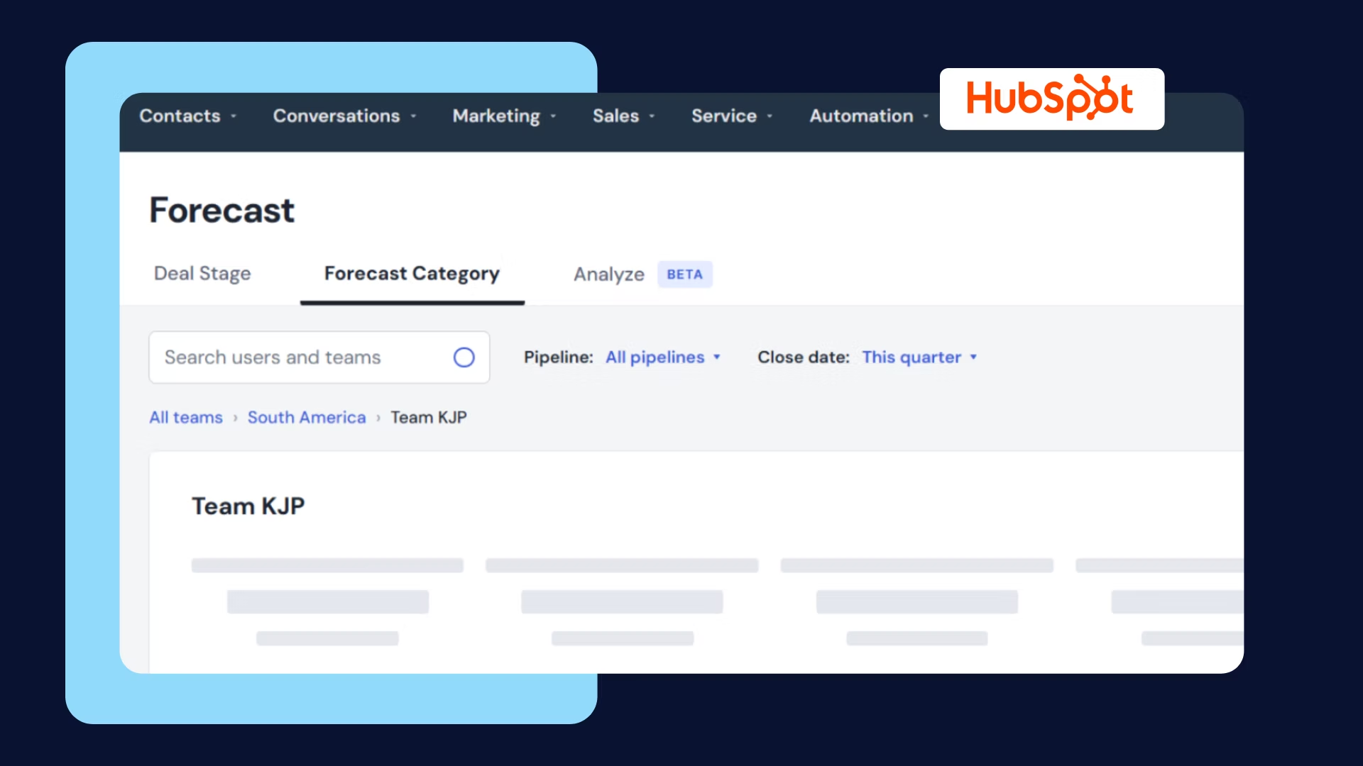
Native CRM dashboards (Salesforce, HubSpot) are the default starting point. Included in what you already pay for, decent for standard pipeline views. The ceiling: they only see CRM fields, and nontrivial customization tends to become someone's part-time job.
BI tools (Tableau, Looker, Power BI) offer unlimited flexibility across data sources. The cost: real setup time, licenses, and a dependency on an analyst or RevOps for every new view. Great when you have that team; a bottleneck when you do not.
AI-generated dashboards are the newest path, and the one we built at Sybill will show you why. You describe the dashboard in plain English, something like "show me the objections in every deal we lost last quarter, broken down by competitor," and get an interactive dashboard back in seconds, built on your calls, emails, and CRM data together. It can be refreshed with the latest data, exported as a PDF or HTML file, and shared by link with people who never log into Sybill. Steps one through four still matter just as much; you simply compress the build itself from weeks to a sentence. If you want to try it on your own pipeline, start a free trial.
Credit where it is due: if your questions are purely CRM-shaped and you have a strong RevOps team, native dashboards and BI tools do the job well. The AI path earns its keep when the questions involve what happened in conversations, or when the analyst queue is three weeks long.

Put the dashboard in front of its intended meeting for two weeks, then ask the audience one question: which widget did you actually use to make a decision?
Cut what nobody used. Sharpen what almost worked. A dashboard is a product, and products need iteration, not a launch party and neglect.
You will recognize at least one of these from a past life:
The everything dashboard. Forty metrics, four audiences, zero decisions. Built to impress in the demo, ignored by week three.
The vanity dashboard. All up-and-to-the-right metrics, no risk indicators. It exists to feel good in front of leadership, and it works right up until the quarter misses.
The stale dashboard. Manual refresh died with the analyst who owned it. Now it confidently reports March.
The garbage-in dashboard. Beautiful charts on top of CRM fields nobody updates. The single-threaded deal count reads zero because nobody logs stakeholders, not because deals are multi-threaded.
The first three are process failures you fix with the six steps. The last one is a data failure, and no amount of chart polish fixes it. Fix the capture layer, starting with tools that update the CRM automatically after every call.
What is the difference between a sales dashboard and a KPI? A KPI is a single measurable indicator of performance, like win rate or pipeline coverage. A sales dashboard is the visual display that brings a curated set of KPIs together, updates them from live data, and puts them in front of the person who acts on them. KPIs are the ingredients; the dashboard is the dish.
What should a sales performance dashboard include? Six to nine metrics chosen to answer specific questions: pipeline generation (coverage ratio, new pipeline per week), conversion (stage-to-stage rates, win rate, cycle length), deal health (deals without next steps, stakeholder engagement), efficiency (deal size, quota attainment spread), and outcomes (bookings versus target, forecast accuracy). Every metric should be tied to a decision someone will make when it moves.
How often should a sales dashboard be updated? The data should refresh automatically, continuously or at least daily, so the dashboard always reflects current reality. The design should be reviewed monthly: prune metrics nobody used to make a decision and sharpen the ones that almost worked.
Can I build a sales dashboard without a BI tool or analyst? Yes. Native CRM dashboards handle standard pipeline views without extra tooling, and AI-generated dashboards like Sybill's go further: you describe the view you want in plain English and get an interactive dashboard in seconds, including conversation-level metrics that CRM-only tools cannot show. No SQL and no analyst queue required.
What makes a sales dashboard effective? Three things: it is built around a specific decision for a specific audience, it contains few enough metrics to be scanned in under a minute, and it sits on trustworthy, automatically captured data. Most dashboard failures trace back to violating one of those three, most often the last one.
A KPI is a single measurable indicator of performance, like win rate or pipeline coverage. A sales dashboard is the visual display that brings a curated set of KPIs together, updates them from live data, and puts them in front of the person who acts on them. KPIs are the ingredients; the dashboard is the dish.
Six to nine metrics chosen to answer specific questions: pipeline generation (coverage ratio, new pipeline per week), conversion (stage-to-stage rates, win rate, cycle length), deal health (deals without next steps, stakeholder engagement), efficiency (deal size, quota attainment spread), and outcomes (bookings versus target, forecast accuracy). Every metric should be tied to a decision someone will make when it moves.
The data should refresh automatically, continuously or at least daily, so the dashboard always reflects current reality. The design should be reviewed monthly: prune metrics nobody used to make a decision and sharpen the ones that almost worked.